 Ugo//Tutorials
How to Turn Any Website Into a Polished Mockup
Paste a URL, pick a frame, export. No screenshotting, no cropping, no Figma. Here is how to create website mockups that look like you hired a designer.
The old way is painful
You want to show your website inside a laptop or browser frame. So you open Chrome, take a screenshot, crop out the tabs and bookmarks bar, paste it into a mockup tool, resize it to fit the frame, realize the aspect ratio is wrong, redo the crop, and then spend five minutes picking a background.
Or you use a tool that does all of that in one step.
Paste a URL, get a mockup
In Mokkit, open the media panel and switch to the URL tab. Paste your website address. The tool renders the page in a real browser at the viewport size matching your selected device, captures a clean screenshot with no browser chrome, and drops it directly into your composition.
No manual screenshotting. No cropping. No resizing. The screenshot fits the frame perfectly because it was captured at the exact resolution the frame expects. Under the hood, captures are powered by ScreenshotOne, so they are fast and reliable even on heavy sites.
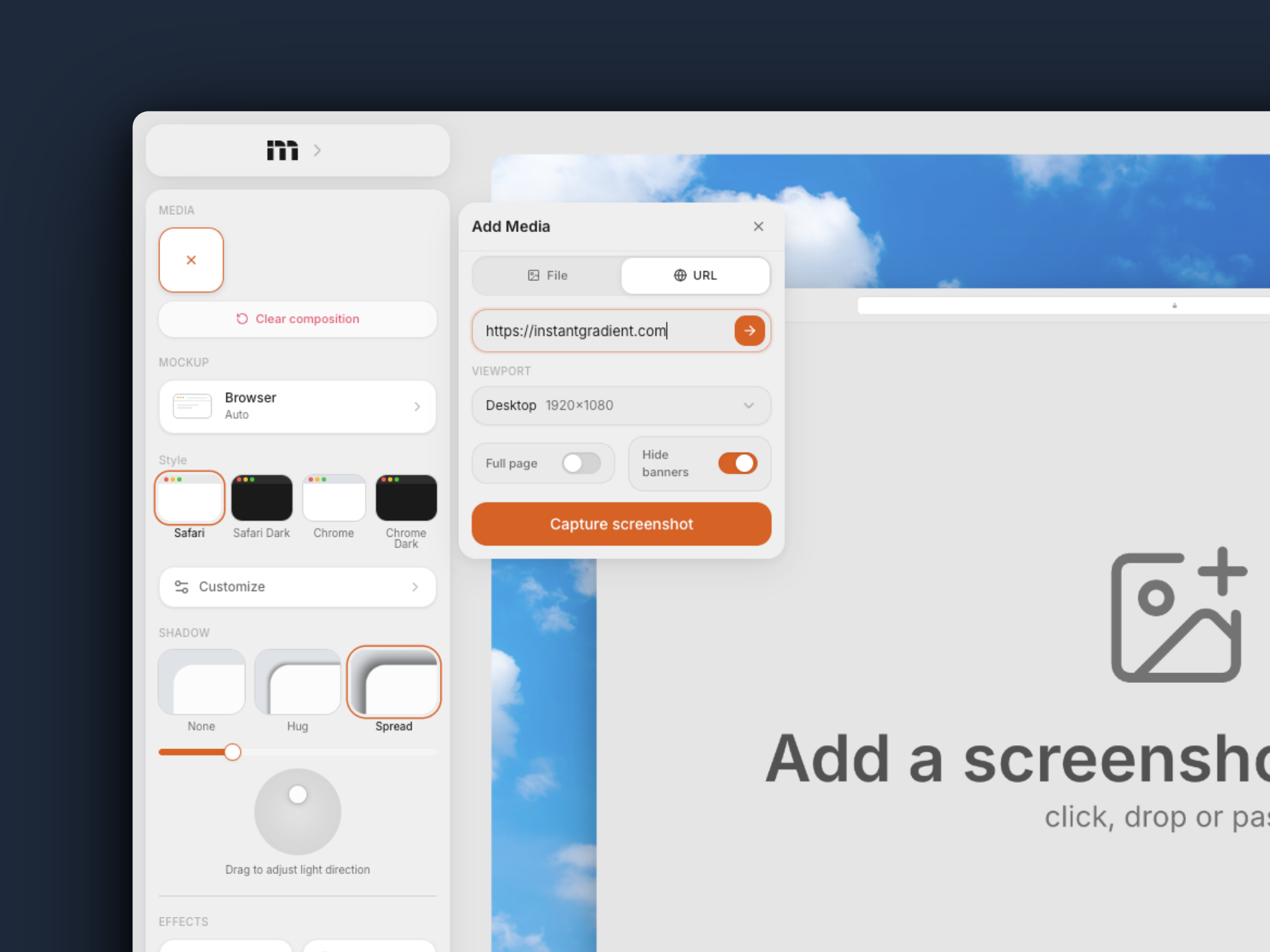
Two options that make this better:
- Full page captures the entire scrollable page, not just the viewport fold. Useful for landing pages where the best section is below the hero.
- Hide banners automatically removes cookie consent popups, chat widgets, and GDPR overlays before the screenshot is taken. On by default.
Browser frame or MacBook frame?
Both work for website mockups. The choice depends on what you are making.
Browser frame (Safari or Chrome, light or dark) shows the URL bar and window controls. It signals "this is a website" immediately. Works best for SaaS dashboards, documentation, landing pages where the context of a browser matters. You can lock the aspect ratio to keep things consistent across multiple mockups.
MacBook frame (14 inch or 16 inch) wraps the screenshot in a physical device. It feels more premium and works better for hero sections, pitch decks, and Product Hunt gallery images where you want the mockup to feel like a product photo, not a screenshot.
No frame (screenshot mode) is also an option. Just the screenshot with rounded corners, a shadow, and a background. Clean, minimal, and fast. Good for blog posts and documentation where the device frame would be distracting.
Step by step
1. Pick your device. Select Browser, MacBook Pro, iPhone 17, or Screenshot from the device panel. If you pick a MacBook or iPhone, the URL capture will automatically match the viewport to the device's screen resolution.
2. Capture the URL. Open the media panel, switch to the URL tab, and paste your address. Toggle "Full page" if you want the whole page. Hit capture.
3. Pick a background. Choose from gradients, macOS wallpapers, solid colors, or upload your own image. A blurred wallpaper behind a MacBook frame looks particularly good.
4. Add depth. Pick a shadow preset (spread or hug) and adjust the light direction. Add background noise for texture. If you want the focus on a specific part of the page, use lens blur to soften the edges.
5. Export. PNG or WebP for static images. If you want motion, switch to animation mode, add keyframes to zoom into a section of the page, and export as MP4.
What makes a website mockup look professional
The content matters more than the frame. A beautiful MacBook frame around an ugly website still looks bad. If you are creating mockups for your portfolio or a case study, pick the best page of the site. Usually the hero section, a pricing page, or a feature section with good visuals.
Dark sites on light backgrounds, light sites on dark backgrounds. Contrast between the screenshot and the background makes the mockup pop. A white website on a white background disappears. A dark dashboard on a dark gradient looks muddy.
Do not over-tilt. A slight perspective angle (5-10 degrees) adds depth. More than that and text becomes unreadable. For screenshot mode with tilt enabled, a subtle lean forward or to the side is enough.
Export at 2x or higher. Website mockups are often displayed on retina screens (your own site, a pitch deck on a MacBook, a social media post viewed on a phone). 1x exports will look blurry. Mokkit Pro gives you 2x (4K), Pro Max gives you 3x (6K).
Multi-page mockups
Mokkit supports up to three screenshots in one composition. For a website, that means you can show the homepage, a feature page, and a pricing page side by side in a single export. Use a multi-slot layout preset (like side-by-side or staggered) and capture each URL separately.
This works well for case studies, portfolio pieces, and comparison visuals where you want to show multiple pages of the same site in one image.
Try it yourself
Paste a URL and see it in a device frame in seconds. No signup, no watermark.
Open MokkitSee also: How to create iPhone mockups · Mokkit vs shots.so · Mokkit vs PostSpark
Related
Most iPhone mockups look like stock photos from 2019. Here is what makes a good one, what to avoid, and how to build one in under a minute.